So today is the day I've been waiting for. It's the day that the new OPC hockey cards hit the shelves. And to make it even more interesting, the release date was pushed back a couple of times. So, as luck would have it, I was driving home from work this afternoon and I found myself near the cardstore. How fortuitous!
One problem. It was 1:30 and no OPC. And my bud the owner wasn't there either. Some dude behind the counter said it was coming, but who knows when. Yikes. What to do? So while he fiddled with his GPS (don't ask) I watched the ballgame on tv.
Now it's 2:30.... still no OPC and I have to go. Crap.
Bummed, I leave and begin the long drive home. I'm about halfway home when I remember that I'm now near another cardstore...one I don't normally buy boxes from. So I head there. $55 and five minutes later, Voici!
I guess old Wayne gets a turn on the box 'cause who knows if Crosby is ever coming back. We'll probably see Howe again next year. Upper Deck is predictable if anything.
36 packs and 6 cards per pack. Ouch. For a "entry level" set, Upper Deck doesn't build it as one. This should be 10 cards per pack at least.
Here's the box bottom for those of you interested in such things.
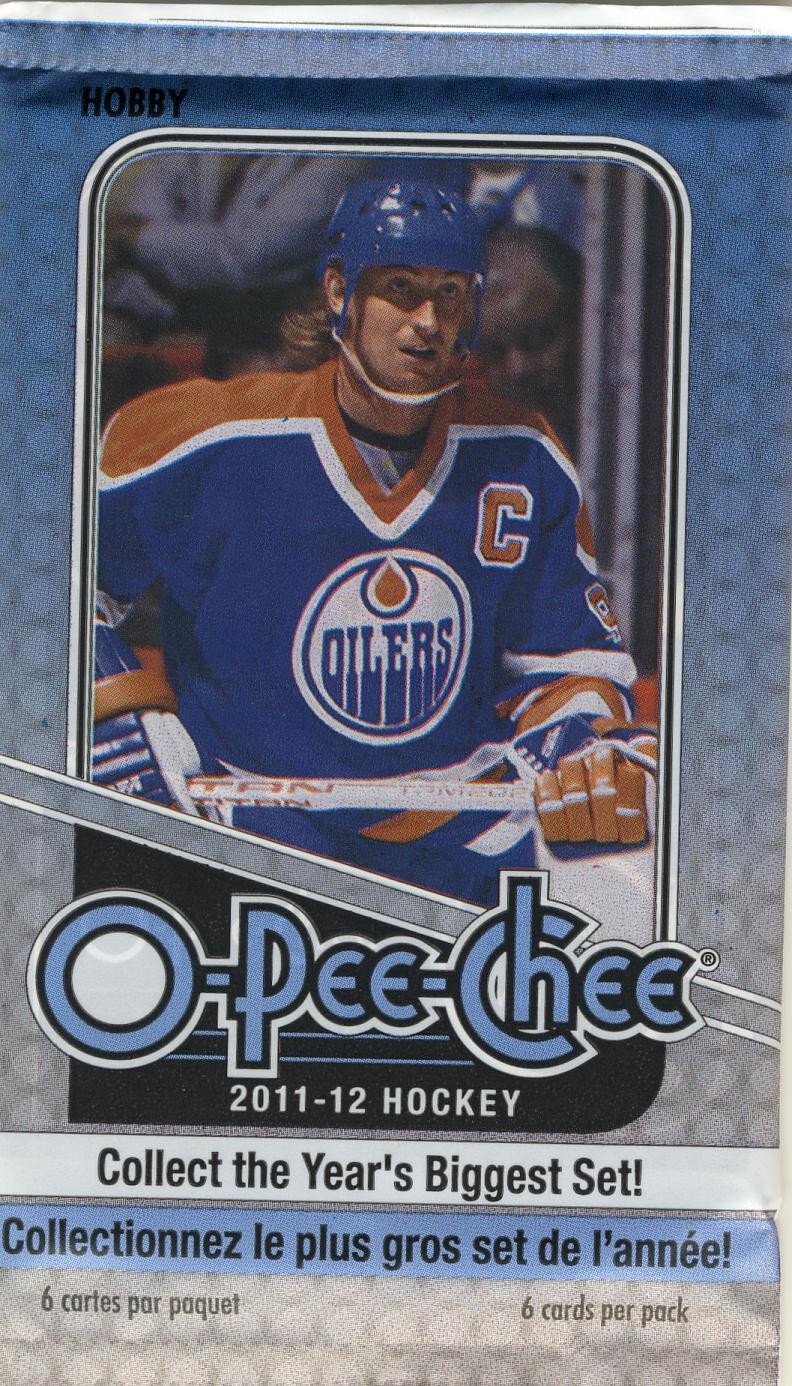
And the wrapper. A wee similar to the box. We're not re-inventing the wheel here....
So let's see the cards!
Here's the base... no more white borders.
do we really need 33% of the front to be taken up by the logo??
How's the back?
simple, boring, and recycled. It's odd that the reincarnation of OPC has bland grey backs to get that retro feel, and yet OPC always had bright, coloured backs.
The base set has a Rainbow parallel again this year...
that backs on these are much better... kinda what the base should be.
Agian, after the 500 card base set, there are 100 short printed cards (501-600) 50 for the legends of hockey...
Definitely a movie poster theme to this entire set.... the backs are..... bland...
Gee NHL, whatever did Mr Hull do between 1972 and 1979??? I hate that the NHL still to this day will not acknowledge the existance of the WHA.
The rookies are similar, and bright...
they at least added some graphics to the backs of these....
Wait... aren't these cards from last year's set? Yep. They put last year's Update set into this year's packs. 1 per 9 packs. That's 4 per box for you math impaired folks...
Of course there are leader cards.... I like these, but I wish they would make them part of the set like the old days instead of an insert set. And bring back team cards!!!
One thing I did like about these this year is that they are now on regular card stock intead of the super thick and glossy stock of the last few years.
And oh yes, the retro parallel. Inserted at one per pack, this year's offering is loosly based on teh 1933-34 OPC set. I think. My memory only goes back so far.
You may have gleemed these on the box bottom at the top of this post. Four different colours, sepia picture, and no mention whatsoever of their first name. Even though the '33/34 cards had them. Plus, we have the hockey version of 2011 Topps Lineage baseball card backs.
Horrible. And again, as you could forget, 40% of the card back is logo. Sweet jesus.
Alright. There you have it. When I'm done busting open the box, I'll give you a breakdown of what I found.
2011-12 OPC Hockey
What I liked
- No white borders.
- Affordable at $55 per box.
- leader and trophy cards on regular cardstock
-different retro cards
What I didn't like
- enough with the 64 point font OPC logo. OPC cards never had this. Get rid of it.
- grey backs. Again, OPC never had this.
- only 2/3 of the front available for photo
- only 150 base cards per box for a 600 card set!!!! What happened to entry level and affordable???


I like the retros but is it just me or do the photos on the Marquee Legends and Rookies look like they were copied and blown up to be grainy? Despite being excited about these, your break here is making me wonder if I should even bother.
ReplyDeleteLooks more 1935-ish to me on the retros. UD never got OPC. The feel has never been right other than the '79-80 clone set they did. THAT was fun.
ReplyDeleteI don't hate it, though. Maybe I'll pick up a team set.
You know what drives me nuts, though? Put the WHA stats on the back! It's not like Bobby Hull simply gave up the game for seven years. All 80's OPC listed those seasons.
Wait - you said that, too. I need to read better and not get caught up in the pictures. :)
ReplyDeleteWow love those retros just not sure if I wanna fork out 55 bucks for a box of OPC...
ReplyDeleteI like the retros, too, and actually dig the backs. Other than that, I am not impressed with this years release.
ReplyDeleteFirst, boring boring BORING design. I agree with you that the OPC logo is way too big. If that wasn't enough, what is up with the little O-Pee-Chee Brand Hockey Cards crawl? We get it, these are OPC cards.
I collected the Legends last year and these look almost identical. Meh. As DFG said, the image quality of the Legends is dodgy at best. Their best attempt was the 79-80 retro Legends; I might actually try and build that.
So, no BIG MOJO HITS?!
I swear with every new set that comes out I get closer and closer to just deciding to go vintage only. I'll pick up any Krejci cards if I find them on the cheap, other than that I'm staying away from these.
ReplyDeleteI finally made the vintage-only call this year. First time ever (at least in years I've collected) that I won't do at least one current set. I'll pick up the odd card I find interesting, but no sets. I just don't look at them once they're done.
ReplyDeleteThe main project will be polishing off the two '63-64 sets (12 cards away) and then I'll see.
Hmmm. I'm looking for a hockey set to do this year. Something to change the pace. I'm thinking OPC isn't going to do it for me.
ReplyDeleteGuy
I don't like the retro cards. I think they should had colour pictures on them. Have the foreground pic with vivid colours on top of the dull background colours.
ReplyDeleteThe retros are fairly true to the mid-30s sets, though. Put a colour picture and it's really not retro anything.
ReplyDeleteThanks for sharing...I like the retros....but that is pretty much it....Certainly a V204 flavour to the retros which I like, but I think they need to put a little more into the base product if they keep hoping to get 60 bucks a box for them retail!
ReplyDeleteI kind of want to open some of this, and I kind of don't. Thanks for the breakdown of the product.
ReplyDeleteThe retros are definitely cool.